Wednesday, May 16, 2007
Collaborative Cartography
Over this past semester, I have experienced the world of cartography (as you have read in all of my blogs). We not only employed the art of cartography to create maps of our own, but we reviewed how cartography is seen and affects people in the world as well. Throughout my blogs, I have talked about x-treme cartography, historical cartography, virtual cartography and many other aspects of cartography that many people don't realize. Cartography is employed everywhere to show many different things. When I started this semester, I had little idea about the importance of cartography let alone know how to use any software to create maps of my own. But I learned how. In the beginning we made maps using data from the census burea (great information and data source) and our project was to portray this data as a map on a poster. My poster was on ethnicity. Using data from the census bureau and software from mapviewer, I created my first map. This was a big step towards my future career. From this process, I not only learned how to find data and put it into a from that could be read by the software I was using, but learned about the software as well. From this, I found out that creativity plays a major role in designing maps and tis is what hooked me. Not only are you showing information to a viewer when designing a map, but you are showing them your creativity as well. You can make a million different maps that all show the exact same thing. The next project in the semester was understanding virtual worlds like Google Earth and how to use them to our benefit when making maps and posters. Google Earth is an amazing thing to have. It gives you a whole different perspective that you can't get looking at anything else. In this project, I decided that I was going to use Google Earth Pro and Nasa World Wind (another virtual world) to talk about cycling through the mother lode in California. Using this software was amazing. Not only could I show pictures that I took about the area I was describing, but I could also use aerial photos that showed this areas topography from space giving the viewer a cooler perspective to look at. With all this new technology that was being presented to me during this class, it gave me a brighter outlook about the future of cartograpy and helped to enhance my own creativity. The last project we set out to do in this class was designing pages that would go into an atlas of Nevada. This encorporated everything I had learned from throughout the semester. With an intended audience of younger kids, I had to decide what kind of information I wanted to show but still keep it fun and interesting at the same time. With the class coming to an end, I have to conclude that I have definitely learned a lot this semester. I have also learned that being a cartographer would actually make a great career. Cartography is used in everyday life and the demand for it only keeps growing and growing. With advances in technology happening all the time, there is no limits and how far cartography will go. Stay tuned and think spatial. Some day in the future, one of the maps you see maybe designed by the mapster.
Mapping Nevada

One of the most interesting things you can do is look at maps of the area that you live in. There is so much information you can learn that you never knew before. Living in Nevada, there is so much vast area where people don't live and unless you were to drive out there, maps would be your only key to learning about these areas. But what if you were the one making these maps. What kind of information would you want your readers to know? In class we are trying to put together an atlas of Nevada hence my topic today, mapping Nevada. We have been discussing for awhile know the topics we think are important and the viewers that we expect would be looking at these maps. So we chose 4th graders as our expected viewers. Making an atlas of Nevada for fourth graders, we don't want to get to detailed and we want to make the maps fun to look at so the fourth graders will not lose their interest. For me, one of the coolest topics and one of the map pages for the atlas that I suggested was on climate. I think this would be a good page because it is important to know why Nevada is the way it is and how the weather affects this. On my climate page, I would talk about how much annual precipitation the Nevada receives, rain and snow. I would also talk about the annual temperatures and give a brief description of what it's like to live in the state of Nevada through each season. I would also like to give a brief description of the rain shadow effect. I think it is important for younger kids to know why Nevada is a desert when nearby California is green and recieves a lot more rainfall. To make this page interesting, I would add fun facts like how many days of sun Nevada expects to see each year or another fun filled fact about weather. As far as the cartography side of this goes, I think it would be interesting to design maps showing the relationships between Nevada's annual precipitation and temperatures or things like that. Another cool image could be taken from Nasa's World Wind. This photograph from space could show what the clouds do as they approach Nevada and disappear during a storm. This would be excellent evidence combined with an actual picture showing the rain shadow effect. There are many different atlas pages we could come up with for Nevada. Nevada is an interesting place and mapping it is even more interesting. The map at the top right was taken from about.com and shows the geology of Nevada
Tuesday, May 15, 2007
Virtual Worlds
One of the most amazing things about technology in todays world is the fact that it is so advanced it is out of this world. With the art of cartography advancing just as fast as technology will allow it to, the world of maps is getting more and more amazing.
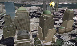
So what is a virtual world? A virtual world basically is an unreal world portrayed as if it were real. With the help of technology, virtual worlds are depicted as almost too real. Virtual worlds today include Google Earth, Nasa World Wind, and many other different softwares that portray the world as realistically as possible. Lets go further in depth into the virtual world of Google Earth Pro (the new edition). Google Earth Pro allows users to view a virtual earth as if it were realistic. You can zoom in on cities and see buildings in 3-dimensions. You can bascially look at any place on the planet in pretty good detail and get a good understanding of what's there, terrain and all. Google Earth even allows you to view the things you want to see. Just a click of the button can show you where national parks are or even where churches are. One of the cool things about the new Google Earth is the fact that you can place pictures of anything up for the world to see. This adds to the realism that Google Earth has to offer. Another one of the amazing things you can do is fly by's. These fly by's allow a user to mark a path any where within the virtual world and have the screen automatically jump there when you push play. This is cool if you want to show people a bike path you have been riding or the golf courses you've played. With all this new technology, there is some cons to using Google Earth Pro. While being a virtual world, it is not as realistic as you might want it to be. There are still many areas of the earth that are not as clear as others. Some of the terrain shown in 3-dimensional form is a bit rough as well. But who can complain. Software like this is very useful to many people professional or not. Software like this can enhance presentations greatly. You can not only show what an area looks like with a topo map or a picture, you can also add a view from space that shows fairly good detail and the physicla landscape. How can looking at urban growth of cities be any easier when you can actually see the buildings and residential areas. In conclusion, virtual worlds are amazing and can be greatly useful. The cons do not outway the pros and this software only gets better and better. The picture above is taken from the google earth website and shows the 3 dimensionality a virtual world can offer.
Thursday, April 26, 2007
Games and Cartography

Well it has been awhile since my last post because I've been busy with work and school. Today I want to talk about how cartography can and is used in games. There are many different games one can play that involves using cartography. More traditionally, one can observe cartography used in games such as Mario Bros. from Nintendo and even in the now popular World of Warcraft. The cartography used in these games usually is just maps detailing these fantasy worlds and showing you the next level and so on. But people can play games that get much more into the world of cartography than that. What if the game you played actually involves creating your own map and then using it to play your own game. Now that sounds like fun. Most people have never heard of the game geospatial disc golf. This game involves alot of the aspects of using cartography and gis while letting you have fun and get a good work out in as well. Who knew all these aspects could be put together into one game. Well geospatial disc golf is fun and challenging as well. It's basically playing frisbee golf for map geeks. The rules and steps to play the game are fairly simple. Using a compass and protractor, you map out the course you want to play. After that you draw a map of the course you designed. Then you retrace your course using GPS. After putting your map and GPS points into a computer, you georeference them so that the map you made and the points you took align. Now everytime you play the frisbee golf course, you can chart how your doing by taking GPS points of all you throws and reviewing them on your map. How cool is that. Combining cartography and games. There are many other ways to enjoy cartography and games that don't involve quite so much of your time having just as much fun as well. Most of these are fun games and tests online that test your knowledge of Geography. These games might tell you the name of a country and then ask you to click on that country using your mouse. This is a true test of your geographical knowledge. Being a Geography major myself, I went online and took one of these tests and only scored a 40%. Now that's sad. There is definitely a lot more countries than I know of. In conclusion, we have once again tied cartography to another aspect of our everyday life. Playing games. The best thing about this is that you not only have fun using cartography, but you learn something as well. Whether is something as simple as studying the map on the Mario Bros game or taking the geospatial disc golf challenge (fun and rewarding too), playing games are just that much more fun when cartograpy is involved.The map above is taken from the Mario Brothers 3 game. Click on the map to view in more detail.
Tuesday, April 3, 2007
X-treme Cartography

With extreme sports becoming more and more popular each year, the art of cartography isn’t far behind. So who knew that there could be such a thing as extreme cartography? There is no better rush than falling out of a plane and drawing a map at the same time! Well, that’s not exactly the point I’m trying to make but it could be fun. Back to the point. Maps are important. To me, extreme cartography is not mapping in extreme conditions, but mapping something extreme or using a map to do something extreme. First, we’ll start with mapping something extreme. Each person probably has a different opinion of what extreme is but we’ll go with mine for now. Mapping Mount Everest seems pretty extreme to me. Even if your sitting at home while doing it, it is the subject that you are mapping that constitutes what is extreme and what is not. What would even be more extreme is if you took that map and used it to climb Mt Everest. Now that’s extreme. So now that we have established some basic guidelines for extreme cartography, let’s talk about some other examples. The U.S military depends a lot on the use of maps for navigating. When a special forces unit parachutes into a foreign country in the middle of the night; they must depend on maps for orientation and navigation especially if the terrain and area is also foreign to them. Another example using the military is the use of range cards. Range cards are made by the gunners of heavy weapons on the battle field and possibly during battle. These range cards are actually little maps themselves. They detail the gunner’s field of view. On the range card, the gunner must draw a map of possible targets, dead space, and any civilian considerations that he sees within his sector of fire. This is extreme cartography! In conclusion, we have once again found another important aspect of cartography. Extreme cartography is important and fun, but also remember that safety comes first.
Tuesday, March 27, 2007
Political Cartography

Politics play an important role in today’s society. With the 2008 presidential elections lurking around the corner, political campaigns are going full speed ahead. For any politician, understanding where the voters are geographically is important when designing an effective strategy for campaigning. It is also important for these politicians to know where the key voters are (minorities, farmers, big business etc.) so they can be sure to plan stops along their nation’s campaign tour. So basically, a smart politician is also somewhat aware of the cultural geography of America.
But these politicians weren’t born with this knowledge and it’s probably more than likely that they weren’t geography majors either. So how do they get and understand this information? With the help of cartography of course. Actually, to be more specific, political cartography. Once again we are back to the underlying theme of all my blogs that cartography is everywhere and involved with everything, even politics.
Political cartography consists of maps that help illustrate politics. For example, on the night of presidential elections, most news stations will have maps showing which states voted republican and which states voted democrat. Politicians running in races there after can look at these maps and see in what areas their party is traditional weak in and change their strategy accordingly. If a politician is struggling with minorities, he can do the same thing by looking at and interpreting maps. Maps can have a major influence on many things. Political maps not only help politicians, but they have many other uses as well. Political maps can be used in political cartoons as propaganda. They can also be used to gain support or visa versa before going to war. These maps have a lot of power and can be very influential towards whatever goals you seek to attain. Political maps are also used widely just to show land partitioning. These maps can help prove that certain areas are controlled by certain people. This helps when trying to pass legislation and laws pertaining to these kinds of things. In conclusion, political maps like any other maps have lots of uses and lots of power if used right.
Map provided by nationalatlas.gov
Friday, March 23, 2007
3-D Cartography
If you are an amateur map reader and your trying to learn about the topography of a certain area, understanding the map could come across as difficult. Without a good understanding of contour lines, elevation marks, and other symbols and features on a map, trying to get a good picture in your mind about the area you are about to explore is frustrating. After staring at this topographical map for just a few minutes, you probably wonder how much easier this map would be to use if it were three dimensional. It would be easier. Adding a 3rd dimension to the map not only makes the map look more exciting, but it also helps the viewer understand it easier.
In most cases, looking at a map that is three dimensional gives the map reader a completely different perspective. This three dimensional view allows the reader to see the map in a way most people could not of imagined while looking at the map in a traditional fashion. For instance, try looking at a topographical map. You probably see the contour lines marking elevation. While everything looks flat on the map, these lines are detailing elevation and are a representation of what the terrain actually looks like. To the untrained eye, this map could be hard to read. Now looking at this same map in a three dimensional format, even a person who has never looked at a map before could tell the differences in elevation and get a good understanding of the terrain.
Three dimensional cartography not only benefits the viewer of the maps, but the cartographers as well. This extra dimension allows cartographers to show their information many more ways and gives the purpose of their maps a whole different perspective. For instance, if you were trying to make a map of downtown New York City and the purpose of this map was to show people the height of each building, a two dimensional map would seem bland and would probably not grab the attention of your viewers. However, a three dimensional map would jump out at your viewers and give them a good idea about the height of each building and a comparison to the other buildings.
In conclusion, three dimensional maps are fun and interesting to look at. They can give any traditional map a new purpose and allow readers to better understand that purpose.
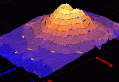
The three dimensional map of a volcano above is taken from http://3dfmaps.com
Tuesday, March 6, 2007
Old Map, New Map

Maps have influenced the world greatly. From the early history of man to today, maps have had a large part in the development of humans. The uses of maps continue to grow greatly as technology advances with time. In the past, only a select view were able to use maps but with newer technology and wider distribution, maps are being used by the media, and by society as a whole.
Maps have had a powerful impact throughout history helping with the civilization and development of humans. The earliest maps date back to the Stone Age and predate any form of written language by thousands of years. In fact, one of the oldest surviving maps is painted on a wall of the Catal Huyuk settlement in south central Turkey and is believed to have been painted around 6200 B.C. (Wikipedia). Throughout the early history of humans, many maps were made to show land plots and mining areas as well. For example, a clay tablet dating back to 3000 B.C. was found and contained a map showing a river valley between two hills. Cuneiform inscriptions, label features on the map which include a plot of land which is owned by a person called Azala. This map also contains markings that detail the cardinal direction. Maps drawn by the Egyptians were found that detail the mountains to the east of the Nile River where gold and silver were mined. These maps included descriptions of the mines, the shelters miners used, wells, and a road network that connected them all.
The purpose of modern maps isn’t much different than those used over 2,000 yrs ago. The only real difference is the technology used to make and view those maps. Maps are much the same now as in the past. People still use maps for land partitioning, city planning and even for mining just as they did in ancient Egypt. The fact that maps have lasted as long as they have is just proof that maps are important in any culture and that finding ways to make and improve maps is always a priority.
The map in the upper right corner of this blog is an old map of North America courtesy of the Ansari map library at the University of Nevada, Reno.
Tuesday, February 27, 2007
Maps and the Media

With daily news growing more important to people everyday, the importance of using maps to help illustrate this news grows as well. Using maps gives the media power to help disseminate information to the general public. Maps started appearing in the media with the development of newspapers. In many countries during the 1800’s, maps were included in the newspaper to show plans for new buildings and city areas. At the time, schematic maps in newspapers could detail natural disasters etc. that would help illustrate such events. With the beginning of the First World War, the use of maps jumped greatly in newspapers. These maps helped present information about what was happening on the war’s front. Some of the newspapers published full page maps of war theatres encouraging people to cut these maps out to help them keep track of the war. These maps would also help to educate people who could not afford to purchase maps or atlases. After world war one the use of maps jumped greatly in newspapers until the arrival of television in the second half of the century. With the development of television in the middle of the 20th century, the power of maps greatly expanded. Allowing people to get the news much faster, television has also helped increase the use of maps. Maps are used in a wide variety of ways on television. In their simplest form, a map is usually used during the traffic segment of a local newscast. Using a reference map of a specific area, the news station can not only tell you, but also show you exactly where there is an accident or a slow down on a road or highway. For some people who can’t understand by listening, looking at a map is an easy way to visualize where the events are taking place. Another good example of news stations on television using maps is during the weather segment. During the weather report, many maps are used to show the viewer exactly what is going on with the weather at a given time. Some of these maps may be aerial photos from space showing cloud cover or they might just be radar maps showing precipitation in the area. Maps of an area showing the temperature of each city is also map that news stations like to show during the weather segment. Lets face it, maps are an essential part of helping viewers understand the news. Without maps, most people would be lost.
Maps are very important in the news today. With newspapers and news stations disseminating news 24/7, the power and importance of maps continues to grow and will continue to grow. The map in the top left corner shows what a typical weather map might look like during a news cast.
Wednesday, February 21, 2007
Animated Maps
Sometimes traditional maps have trouble getting there purpose out or are just plain boring. For example, lets say you are looking at a map of the current weather pattern heading toward your area. On a traditional map, this would probably look like an image of a bunch of clouds put on to a two dimensional surface. Looking at this map, you might have trouble guessing exactly which direction the clouds are moving. Taking this same map and turning it into an animated map would allow you to get a better understanding of what the weather was actually doing.
Animated maps add a "temporal component to a map displaying change in some dimension" (wikipedia: animated mapping). These maps help to show change over time at either a much faster or much slower rate than real time. These maps are typically easy to understand and less boring to look at because something is actually moving on the map. Using actual motion, these maps do not have to rely on arrows to show movements.
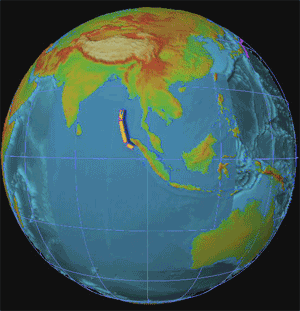
The map above shows an animation of the 2004 Indonesian Tsunami. The movement on this map shows the path and intensity of the waves as they hit surrounding land masses. If this map was not animation, it would probably be harder to understand and less fun to look at.
Animated maps provide another dimension to traditional maps. They can show an event that has happened or is happening (weather) in actual motion. These types of maps help focus on a certain purpose and usually help to draw the reader in. In conclusion, if you are making a map of something that can possibly use animation, it would probably be better for more fun for your audience to look at if you did so.
Wednesday, February 14, 2007
Maps and the American Identity
America is a wonderful place. There are many different aspects of American life that place this country among the top in the category of best places to live. America is diverse in many ways from the amazing cultures and religion to its beautiful scenery and many different climates. For somebody who has never been to America, understanding this diversity can seem overwhelming and almost impossible. But there are ways for one to get a better understanding of America’s identity without having to travel to every part of the country. America’s identity can be best understood by looking at maps.
Now the first question many people have is how can a map show America’s identity. The answer is that not all maps are for navigational purposes. Maps can be used to show all kinds of information on many different topics. For a person whose never been to America, maps can be a very useful guide into helping them understand America’s identity. For example, if a person from Italy wanted to visit America and wanted to see what Italian/American culture was like, they could look at a map showing where the concentration of Italian Americans are. If a person from Egypt was visiting America and really wanted to visit a place with snow, they could look at a climate maps showing areas where it snows and they could look at another map showing Ski resorts in that area.
One of the best places to get information and maps on America’s identity is from the census bureau. Using the census, one can get unlimited amounts of information on just about anything pertaining to America and its population. This information can be used in a multitude of ways. For a person visiting America, census maps of population density would be very useful if you didn’t know cities that well but you wanted to visit a large one. Without using this reference, it would be easy to think you will be going to Austin Texas but you end up in Austin Nevada. Maybe you have lots of money and you want to visit a place in America that is wealthy. Look at one of the census maps showing income and go to the place with the largest income.
America’s identity is amazing and full of diversity in every aspect. Without good knowledge of this identity, it is easy get lost or feel overwhelmed if you are visiting this country. To help avoid almost certain disaster, check out the many maps of the American identity first. Reading and understanding these maps will give you a great understanding of what American life really is.
Wednesday, February 7, 2007
Map Fact, Map Fiction


Map Fact, Map Fiction
There are many different kinds of maps that people use today. One of the most recognized of these maps is your typical road map. This kind of map represents fact. Everything on these kinds of maps represents reality. Basically, every feature on the map represents an actual thing or place in the world. Maps of fact are used everyday by millions of people for a variety of reasons. One could use this kind of map for navigational purposes, or even for educational purposes. Because these kinds of maps represent fact, studying them can help one get a sense of the world around them. Like I stated earlier, one of the most common types of fact maps are road maps. Below is an example of a road map. This map is taken from Mapquest.com and just shows navigational directions from one point to the next. These maps can be very useful if you don’t know the area your driving in that well. While we have a basic understanding of what a fact map is because we use them all the time, there is also another kind of map that is important in society.
Most maps that are used are a representation of reality. That is, they are portraying a real place. Some maps do not have this same purpose. Maps can also represent a fictitious place as well. Many maps are drawn of places that do not exist or only exist in the mind of some. These are maps representing fantasy. Maps have the power to stir up imagination. You can draw maps to help illustrate a place that only you can imagine but a place you want others to see. You can also draw maps of a place you know is there, but a place that no one has seen before.
Maps can have just as much power in a completely fictitious world as they do in reality. Directors of movies often use maps to show the worlds in which their characters live in. Even though these are just worlds of fantasy, maps of these places give a sense of realism to the viewer. Pictured below is a map of “Middle-Earth” taken from the movie Lord Of The Rings. While this movie is based on a fictional story, the map gives this place a sense of realism and almost tricks the viewer into believing that this is an actual place. Using maps of fiction during film also helps a viewer to understand the story better. During the movie Lord Of The Rings, many different places were mentioned. One character was going to this town while another character was going elsewhere. Showing a map during the movie helped one gain a sense of direction and a better understanding of what was going on. So this map of fiction not only helped us get lost in the fantasy of the movie, but it helped us understand it as well.
Wednesday, January 31, 2007
Typography and Maps

For the amateur map reader (someone who doesn’t deal with reading maps often), looking at maps can be discouraging and can often give one a headache. Trying to understand the Typography of maps is usually the cause of most people’s pain when trying to read a map. Looking for certain cities or routes can be hard if the text is too small to see or is nowhere near the feature it is trying to describe. So what is good typography and how does it affect ones view of a map?
Just like reading an advertisement in a magazine, each map has a purpose to get out to the reader. Using typography correctly, this purpose can be clearly understood. When looking at a map, you want to be able to clearly understand what the map is showing you. The map needs to be readable and legible to be effective. The text on the map should be in a small enough font to not overwhelm the map itself, but large enough to be easily read. The text on the map should also have clarity. Typically you wouldn’t want to write all the text in cursive because that could make it harder to read and blend into the background making it almost invisible. Point size and placement is also important. Points should be consistent with text so as to not keep the reader guessing what feature goes with which label. Point size can be used effectively to show the size of the feature as well. Only use as much text as you have to. Too much text can blur the map and it could lose its effectiveness to the reader.
An example of a simple but effective map is this map of Afghanistan.
Just taking a quick glance at the map, one can tell that this map is legible and readable without having to look long and hard. Each city is clearly marked with a reasonable size font and color and has a good relationship to the point that it represents. No confusion between label and feature on this map. The font size on this map is used perfectly as well. With the smaller cities in smaller font and the capital city in larger bolder font
we are easily able to distinguish the difference between the two. With good use of color on the text, it is easy to tell the difference between the cities, states, and rivers. Point size and shape is very consistent throughout this entire map. The text on this map is used effectively and very legibly as well. With not too much text, the purpose of this map is not lost. The font type is easy to read giving little headache to the reader as well. This map also has an easy to read legend for quick reference.
This map is very legible and easy to read. It follows the basic guidelines of typography on maps and is simple to understand to any person reading it. While being simple, this map is very effective and easy to read for anybody.
Thursday, January 25, 2007
Subscribe to:
Comments (Atom)