Sometimes traditional maps have trouble getting there purpose out or are just plain boring. For example, lets say you are looking at a map of the current weather pattern heading toward your area. On a traditional map, this would probably look like an image of a bunch of clouds put on to a two dimensional surface. Looking at this map, you might have trouble guessing exactly which direction the clouds are moving. Taking this same map and turning it into an animated map would allow you to get a better understanding of what the weather was actually doing.
Animated maps add a "temporal component to a map displaying change in some dimension" (wikipedia: animated mapping). These maps help to show change over time at either a much faster or much slower rate than real time. These maps are typically easy to understand and less boring to look at because something is actually moving on the map. Using actual motion, these maps do not have to rely on arrows to show movements.
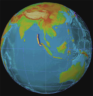
The map above shows an animation of the 2004 Indonesian Tsunami. The movement on this map shows the path and intensity of the waves as they hit surrounding land masses. If this map was not animation, it would probably be harder to understand and less fun to look at.
Animated maps provide another dimension to traditional maps. They can show an event that has happened or is happening (weather) in actual motion. These types of maps help focus on a certain purpose and usually help to draw the reader in. In conclusion, if you are making a map of something that can possibly use animation, it would probably be better for more fun for your audience to look at if you did so.
No comments:
Post a Comment